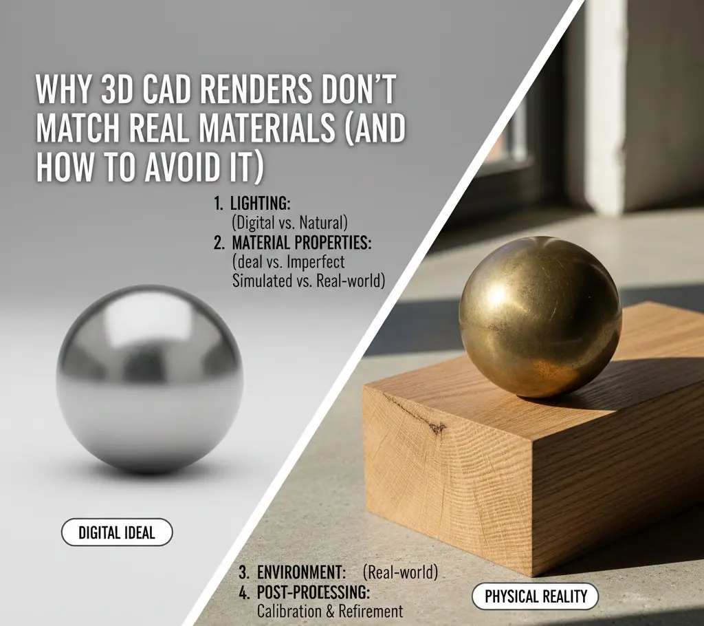
Why 3D CAD Renders Don’t Match Real Materials (And How to Avoid It)
In today’s design pipeline, the render isn’t just a preview. It’s the pitch, the promise, and the image that convince clients to say yes before anything exists. Big decisions ride on it and big budgets, too. Yet, that familiar problem keeps resurfacing, the moment when the built result doesn’t line up with what was sold on screen.
This disconnect isn’t rare. It’s routine. Industry surveys show that well over half of visualization professionals have dealt with unhappy clients after materials failed to translate from render to reality. That frustration doesn’t come from sloppy modeling alone. It’s usually a chain reaction. Physics misunderstood. Displays miscalibrated. Data simplified where it shouldn’t be. Closing the gap means understanding how light actually behaves, and how software only approximates it.
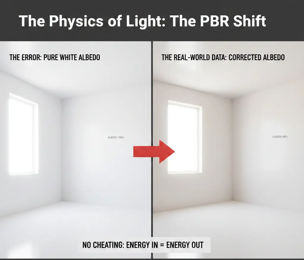
1. The Physics of Light: The PBR Shift
If a render feels off, start with the math behind it. Most modern engines (V-Ray, Corona, Octane, Enscape) lean on Physically Based Rendering. PBR tries to follow real-world rules. Energy in. Energy out. No cheating. In theory, this should get us closer to reality. In practice, only if it’s used correctly.
The Albedo vs. Color Trap
Materials don’t really have color the way we talk about it. They have reflectance. Albedo is simply how much light a surface sends back. That’s where things often go wrong. Designers reach for pure white when texturing walls because it looks right on screen. Technically, it isn’t.
- The Error: A digital wall set to pure white reflects every photon it receives. One hundred percent. Real paint doesn’t do that. Not even close. The result is blown-out highlights, strange light bleed, and a room that feels flatter than it should. The space gets brighter, but less believable.
- The Real-World Data: Most white paints have an Albedo value of roughly 75% to 85%. Failing to account for this 15% light absorption is the primary reason that makes it look flat or sterile.
2. The Fresnel Effect: Why Perspective Changes Appearance
One of the most common cad drafting mistakes related to rendering is the Fresnel Effect. This is a law of physics stating that the amount of reflection you see on a surface depends on your viewing angle.
The Physics in Action
- Think about a hardwood floor for a second. Stand still and look straight down. Almost no reflection. Now lift your eyes and glance toward the far wall. Same surface, completely different behavior. Suddenly it shines.
- The Digital Mistake: Basic CAD materials ignore that nuance. They rely on a single, global reflection value. One slider. One look. The result feels synthetic, like plastic wrapped around wood. Uniform. Lifeless.
- The Solution: Serious renders don’t guess. They calculate. Index of Refraction matters, even for materials you don’t think of as transparent. Glass sits around 1.52. Water closer to 1.33. Miss those values (or fake them) and the eye reacts immediately. The surface slips into that uncomfortable zone where it’s almost real, but not quite.
3. Texture Scale and “Tiling” Fatigue
Every model wears an image. Wood grain. Stone veining. Fabric weave. How that image gets wrapped (the UVs) decides whether it convinces or collapses.
- The Problem of Repetition
Reality doesn’t repeat itself neatly. Carrara marble doesn’t loop every two feet. Wood knots don’t clone. Digital textures do. A small map stretched across a long wall ends up repeating again and again. Ten copies of the same moment.
- The Visual Impact
The brain catches it instantly. Patterns jump out. Immersion breaks. Even viewers with no technical background sense something is wrong, and once they see it, they can’t unsee it.
When it sees the same “knot” in a wood grain repeated every two feet, it instantly devalues the material as “fake.”
A study in Computer Graphics Forum found that repetition in textures reduces perceived realism by up to 40%, even if the lighting is perfect.
4. The Metamerism Conflict: Lighting Temperature
Metamerism is a phenomenon where two colors look identical under one light source but different under another. This is the silent killer of material matching.
Hardware vs. Reality
- The Digital Environment: Designers often render with a Perfect White light ($5500K-6500K$).
- The Physical Environment: On-site, the building may use warm LED lamps ($2700K$) or be subject to the blue-tinted light of a cloudy day.
- The Disconnect: A material that looks Neutral Grey in a render may look “Muddy Brown” or “Cold Blue” once installed.
- The Data: Research shows that variation in the Color Rendering Index (CRI) of light bulbs can shift the perceived hue of a material by up to 15%. If your render doesn’t simulate the specific CRI of the intended light fixtures, the material match is impossible.
5. The Perfect Surface Lie (The Lack of Imperfection)
Real materials have “noise.” They have dust, fingerprints, micro-scratches, and slight warps. Digital CAD models are mathematically perfect.
The “Roughness” Map
In 3D rendering, “Roughness” or “Glossiness” maps are used to tell the software which parts of a surface are shiny and which are dull.
- The Mistake: Applying a uniform roughness value.
- The Reality: A real polished concrete floor has areas of higher buffing and areas of foot-traffic wear.
- The Fix: Professional High-Fidelity renders use Surface Imperfection Maps. By adding a layer of subtle “smudges” to the reflection, the light breaks up naturally, mimicking the entropy of the real world.
| Material Property | Digital Assumption (Failure) | Physical Reality (Success) |
| Edge Detail | Perfectly sharp $90 corners | Subtle 1mm-2mm Bevels or Fillets |
| Surface | 100% Flat and Smooth | Micro-displacements and Bump maps |
| Reflections | Constant and uniform | Angle-dependent (Fresnel) |
| Transparency | Pure clear | Includes Volumetric Fog or Absorbance |
6. Global Illumination and Color Bleeding
Light doesn’t just hit a surface and stop; it bounces. This is called Global Illumination (GI).
The Color Bleed Error
If you have a vibrant red carpet next to a white wall, the white wall should have a subtle pink tint at the bottom where the light has bounced off the carpet.
- The Problem: Many “Real-Time” renderers (like those built into Revit or basic SketchUp) simplify these bounces to save processing time.
- The Result: The materials look “pasted” onto the scene rather than integrated into it. Without Color Bleeding, the materials look like they belong in two different rooms.
7. The Hardware Gap: Monitor Calibration and the sRGB Trap
The most frequent point of failure in material matching isn’t actually in the CAD software; it is in the Monitor. If you are designing on a standard office monitor while your client is viewing the render on a high-brightness tablet, the material is being filtered through two different lenses.
The Color Gamut Reality
Your screen is lying to you. Not maliciously, but consistently.
Most everyday monitors only show a slice of the sRGB spectrum. Roughly three-quarters of it, on a good day. That’s fine for emails and spreadsheets. It’s a problem for rich fabrics, saturated paints, and complex metallic finishes that live outside that range.
- The Error: Colors get fixed by eye. Sliders get nudged until things feel right. But if the display isn’t calibrated, you’re correcting an illusion. The values drift into territory that doesn’t exist in the real world, even though they look perfect on your desk.
- The Solution: Measure instead of guessing. A hardware colorimeter (X-Rite, Datacolor Spyder) keeps your display honest. Recalibrate monthly. No shortcuts. On top of that, work in linear color. Apply a LUT that matches the actual lighting conditions of the site. When color is grounded in data, surprises disappear.
Get Ideal 3D CAD Rendering Services In A Click!
8. Digital-to-Physical Calibration: The “Sample Scan” Method
The most effective way to ensure a match is to stop guessing. Instead of using a generic wood texture, you must use Scan-Based Texturing. Not using optimal techniques is one of the most common texture mapping mistakes in the modern world.
Photogrammetry and PBR Scanning
High-end firms are now using scanners. It helps create custom textures from the actual physical samples chosen for the project.
- Step 1: Use a high-resolution flatbed scanner. You can also go for a DSLR camera to capture the Albedo (base color).
- Step 2: Use software like Adobe Substance Sampler. It helps generate the “Normal” and “Roughness” maps from the photo.
- The Result: The software no longer calculates theoretical wood. On the contrary, it calculates the specific light-response of the exact walnut veneer specified in the contract.
Firms using scan-based material workflows report a 50% reduction in client-requested revisions regarding material finishes.
9. The “White Balance” and Environment Strategy
A common mistake is rendering materials in a Void or a generic Studio environment. In reality, a material’s appearance is defined by its surroundings.
The HDRi Advantage
To avoid the “floating furniture” look, use a High Dynamic Range Image (HDRi) of the actual site or a similar environment.
- Why it works: An HDRi provides 360 degrees of real-world lighting data. If the building is in a forest, the green light from the trees will naturally “tint” the materials.
- The Check: Always place a Digital Grey Card and a Chrome Ball in a test render. If the grey card looks neutral and the chrome ball shows the environment clearly, your material light-response is calibrated.
10. Managing Client Expectations: The “Physical-Digital” Hybrid
Even with perfect tech, the human eye is subjective. The ultimate solution is a Hybrid Presentation.
The “Sample Board” Workflow
Never show a 3D render in isolation. Always have the physical material palette present.
- The Disclaimer: Every professional render should include a watermark or caption stating: Lighting and texture are digital simulations. Refer to physical samples for final color and finish approval.
- The Value: This protects the firm legally and resets the client’s brain to view the render as a conceptual guide rather than a contractual photograph.
11. The Psychology of Perception: Why the Brain Rejects Renders
Even when the math is perfect, the human brain often identifies a render as “off.” This is due to a psychological phenomenon known as the Uncanny Valley of Materials. Our brains are evolved to detect subtle cues in our environment that signal safety, cleanliness, or structural integrity. When a 3D render provides 95% of the visual data but misses the remaining 5%, the brain focuses entirely on the missing pieces.
The Entropy Factor
In nature, everything is in a state of decay or transformation. A real wooden table has a slight cup to the planks; a real marble slab has micro-fissures.
- The Error: Digital CAD models often ignore geometric entropy.
- The Solution: To make a material match reality, you must introduce “Imperfection Geometry.” This means slightly jittering the vertices of a 3D model so that a long wall isn’t a perfect mathematical plane. When light hits a slightly “imperfect” wall, it creates subtle gradients of shadow that the brain perceives as “natural.”
- Data Point: Architectural psychologists have found that humans perceive spaces with organic irregularity as 30% more “comfortable” and “authentic” than those with perfect Euclidean geometry.
Subsurface Scattering (SSS): The Secret of “Soft” Materials
Why does a 3D-rendered marble countertop often look like plastic or painted wood? It’s because the designer ignored Subsurface Scattering.
- The Physics: In materials like marble, skin, or wax, light doesn’t just bounce off the surface. It penetrates the surface, bounces around inside, and exits at a different point.
- The Disconnect: If your CAD material is “opaque,” it looks hard and dead. By enabling SSS and defining the “Scatter Radius,” you give the material that inner glow that characterizes genuine high-end stone.
12. The Handoff: From Render to Specification (The Metadata Link)
The final reason renders don’t match reality is a breakdown in communication. The person making the render is often not the same person writing the specification or ordering the material. This “Data Silo” is where the most expensive mistakes happen.
Integrating Manufacturer Data (BIM-Linked Materials)
In 2026, the leading edge of design is the use of Manufacturer-Verified Digital Twins. Instead of creating a “generic velvet,” designers are downloading “Digital Material Assets” directly from manufacturers like Maharam or Steelcase.
- The Advantage: These files come pre-loaded with the exact Albedo, Roughness, and Metallic values measured in a laboratory.
- The Protocol: Every material in your 3D scene should be tagged with a Unique Material ID that corresponds directly to the project’s specification manual. This will not only reduce 3D printing cost but also improve execution time.
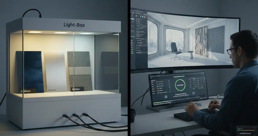
The “Light-Box” Validation Standard
To truly avoid discrepancies, firms are now implementing a Light-Box Audit.
- The Workflow: The physical material sample is placed in a calibrated light box. The box is set to $3000K$ (Warm), $4000K$ (Neutral), and $6500K$ (Daylight). The 3D render is then adjusted on a side-by-side monitor. This process continues until it matches the physical sample in all three lighting scenarios.
- Economic Impact: This audit adds approximately 4 to 6 hours to the pre-visualization phase. Considering the amount of time for its execution, it reduces the risk of a rejected shipment or on-site replacement. So, it saves $10,000 to $100,000+, depending on the project scale.
13. The Impact of Global Illumination (GI) and Indirect Lighting
In the physical world, we rarely see an object lit by a single source. We see it through Indirect Illumination, the light that bounces off the floor, the walls, and the ceiling.
The “Color Bleeding” Reality
If you have a bright blue accent wall next to a white marble floor, that floor will have a blue tint. Many CAD renders utilize “biased” rendering shortcuts that turn off color bleeding to save time.
- The Result: The marble looks too white/grey, and the client thinks the physical floor is “dirty” or “off-color” when it arrives on-site and reflects the blue wall.
- The Fix: Use Path Tracing or Unbiased Rendering. These algorithms calculate every light bounce. While it increases render time by 2x or 3x, it is the only way to accurately predict how materials will influence each other’s appearance in a shared space.
Conclusion: Mastering the Art of Material Integrity
The goal of a 3D CAD render isn’t to be a perfect mirror of reality, but to be an honest representation. The mismatch between the screen and the site is caused by the oversimplification of light, the lack of surface entropy, and uncalibrated hardware.
By embracing Physically Based Rendering (PBR) principles, utilizing custom material scans, and maintaining hardware calibration, you can turn your renders from “pretty pictures” into accurate scientific simulations. When the digital and physical worlds align, you don’t just win the client’s approval, you win their trust.
Pre-Flight Checklist
| Category | Action Item | Verified? |
| Geometry | Have I added $1mm-2mm$ bevels to all sharp $90^\circ$ edges? | [ ] |
| Texture | Is the texture scale set to real-world dimensions (UV Mapping)? | [ ] |
| Physics | Does the material use a Fresnel/IOR value ($e.g., 1.52$ for Glass)? | [ ] |
| Lighting | Does the light temperature ($K$) match the specified fixtures? | [ ] |
| Imperfection | Have I added a subtle “Roughness Map” to break up reflections? | [ ] |
| Hardware | Has my monitor been calibrated within the last 30 days? | [ ] |
Frequently Asked Questions (FAQs)
1. Why does my gold material look like yellow plastic?
This is usually due to a lack of a “Metallic” map and an environment to reflect. Metals don’t have a “color”; they have a “Reflected Color.” Without an HDRi environment to provide something for the metal to reflect, it will appear as a flat, matte yellow.
2. How do I fix “tiling” patterns on large floor areas?
Use “Texture Bombing” or “Multi-Texture” plugins. These tools randomly rotate and offset the texture map across the surface, ensuring that the same wood knot or stone vein never appears in a recognizable pattern.
3. What is the best light temperature to use for material reviews?
Standard D65 (6500K) is the industry standard for neutral color evaluation. However, if the project is a high-end restaurant with $2400K$ lighting, you must render at that temperature, or the materials will never match the on-site reality.
4. Can I use smartphone photos as textures?
Yes, but you must remove the “shadows” and “highlights” from the photo first (Delighting). Professional software like Substance or Materialize can help “flatten” the photo so the 3D software can calculate its own lighting.
5. Why is “Beveling” so important for realism?
In nature, a perfectly sharp $90$-degree edge does not exist. A sharp edge in CAD cannot catch a “specular highlight.” By adding a tiny bevel, you allow a thin line of light to hit the edge, which defines the shape of the object and makes it look “solid” rather than like a digital plane.