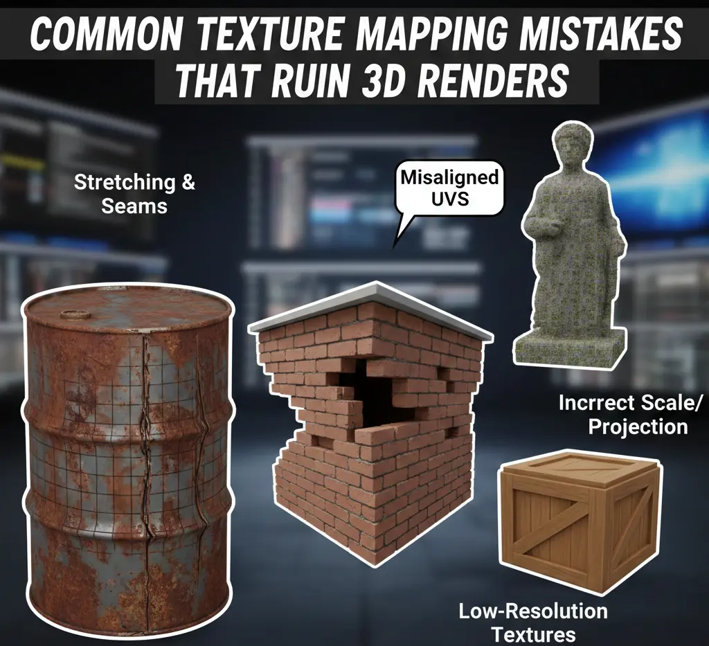
Common Texture Mapping Mistakes That Ruin 3D Renders
Look at any high-end 3D render, and you might think the magic is in the lighting. It isn’t. The thing that tells your brain this is real is the texture mapping. Yet, a massive chunk of projects end up in the digital trash bin because of sloppy mapping. We’re talking about roughly 70% of professional critiques focusing on surface errors rather than the actual 3D model. If your wood grain looks like it went through a blender, or your metal reads more like dull gray rubber, the illusion collapses fast—no second chances. The viewer clocks it instantly.
Texture mapping is supposed to be the moment where a lifeless mesh turns believable. Instead, it’s where things quietly fall apart. One slipped UV, one rushed unwrap, and suddenly the render feels dated, like something pulled from an old mobile game no one remembers.
So let’s be blunt. These are the texture mapping mistakes that sabotage otherwise solid work. Small errors lead to big consequences. And yes, every one of them can be fixed if you know where to look.
1. The Taffy Stretch: Bad UV Proportions
This is the most obvious amateur move. You see it everywhere—a brick wall where the bricks look like long, thin strips of gum.
The Problem
It happens because 3D software doesn’t know the shape of your texture. If you have a long rectangle and you tell the computer to just “fit” a square texture onto it, it’s going to pull those pixels until they scream. This distortion is a total immersion killer. It happens most on curved objects (think pipes or car fenders) where the software tries to project a flat image onto a rounded surface and fails miserably.
The Fix
Stop guessing. Apply a checkerboard texture before you do anything else. If those squares look like diamonds or rectangles on your model, your UVs are broken.
- Relaxation: Use the “Relax” tool in Blender or Maya. It’s like ironed-out laundry; it pulls the UV vertices until the tension is gone.
- Manual Scale: Sometimes the “auto-unwrap” is just bad. Manually scale your UV islands until they match the actual dimensions of the 3D mesh.
2. The Blurry vs. Sharp Disaster
You’ve seen it before. The floor looks razor-sharp. The table on top of it? It is soft, smudged, and almost embarrassing. That contrast isn’t an artistic choice; it’s a texel density problem.
The Problem
Texel density is just the relationship between surface size and texture detail. This simple idea is commonly ignored. Newer artists often give microscopic objects, like a shirt button or a screw head, huge chunks of the texture map. Meanwhile, the main surface gets starved. The scene turns uneven fast. One area screams high-end—the next whispers in the early 2000s. Even if viewers can’t explain it, they feel the disconnect.
The Fix
Uniformity wins. Pick a target resolution and respect it. Scale UVs so every object earns its detail proportionally. When everything speaks the same visual language, the scene finally settles into place.
- The Ruler Method: Most 3D tools have a “Texel Density” checker. Select your floor, get its density value, and then “paste” that same value onto every other object in the scene. This ensures that every square centimeter of your 3D world has the same amount of pixel detail.
3. The “Infinite Grid” Trap
Nature doesn’t repeat itself. Computer programs do, especially in rendering and 3D rigging. That’s the problem.
The Problem
You find a great stone texture. It’s high-res. It’s perfect. But then you apply it to a large courtyard. Suddenly, you see it as a dark splotch that repeats every five feet. Your brain instantly flags it as a “fake.” This “wallpaper effect” is the fastest way to turn a professional architectural render into a joke. The larger the surface, the more obvious the pattern becomes.
The Fix
You have to break the rhythm.
● Texture Bombing
Repeating tiles give themselves away fast. The eye spots the pattern, then it won’t let go. One workaround is controlled chaos. Use a shader that rotates, flips, or offsets the texture each time it repeats. Try the same image but with a different orientation. Like shuffling cards mid-game. The repetition fades into noise, and the surface suddenly breathes.
● Grunge Overlays
Perfect textures look fake. So, always break them. Grab a second texture (something large, messy, and unrelated) and lay it gently over your base material. Because it lives on a different scale, it never lines up with the original tiling. The grid dissolves. What’s left feels worn, accidental, real.
● Vertex Painting
If you’re in a game engine, paint a second texture (like moss or sand) over the seams. It hides the repeat and adds a story to the environment.
4. The “Floating” Object: No Contact Shadows
Why does that chair look like it’s photoshopped poorly onto the floor? It’s because it has no “feet.”
- Light doesn’t just bounce around politely. It gets stuck. It pools. It disappears into tight spaces.
- In reality, the gap where a chair leg meets the floor isn’t softly lit—it’s nearly black. That darkness is ambient occlusion at work. Most render engines try to simulate it, but they gloss over the small stuff. Corners. Cracks. Contact points. Miss those, and everything starts to float. Objects lose mass. They feel like they’re hovering, not resting.
The Fix
Lock the shadows in place and bake them.
- AO Maps: Tools like Substance Painter can generate an ambient occlusion map that spells it out for the renderer. This texture marks where light should die off completely. Once those micro-shadows are back, your scene stops drifting and finally feels grounded.
- Multiply: Don’t just plug it into the AO slot. Sometimes you need to manually multiply that shadow map over your base color to really ground the object. It makes the corners look dark, and the contact points look heavy.
5. The Slick Plastic Problem
Nothing in the real world is perfectly clean. Even a mirror has a layer of dust or a fingerprint.
The Problem
Artists often set a material’s roughness to a single number, say, “0.1” for a polished wood floor. This creates a mathematically perfect reflection. And because it’s perfect, it looks fake. Real surfaces are a mess. They have areas that are shinier where people walk and duller where dust collects. If your roughness is a flat, solid color, your material will look like cheap, molded plastic every single time. Also, it will increase the 3D printing cost significantly and cause insane clashes.
The Fix
Every material needs a story.
- Roughness Maps: Use a map that has variation. A good roughness map should be a chaotic mix of grays.
- Smudges: Add subtle fingerprints near door handles. Add scuff marks in hallways. These aren’t dirt; they are “information” that tells the viewer’s brain the surface is real. If the light hits a smudge and the reflection blurs for a split second, the illusion is complete.
6. The Inverted Bump: Normal Map Flips
You look at your brick wall, and something is wrong. The mortar is sticking out, and the bricks are sunken in. It looks like an optical illusion that hurts your eyes.
The Problem
There are two ways computers read “bump” data: OpenGL and DirectX. One thinks “Green means up,” and the other thinks “Green means down.” If you use a texture made for one system in the other, everything is inverted. Your scratches become ridges, and your buttons become holes. It’s a common mistake because there is no universal standard.
The Fix
Flip the green.
- The Green Channel: You don’t need a new texture. Go into the settings for your normal map and look for a checkbox that says “Invert Green Channel” (or Y-axis). Instantly, the bricks will pop out, and the mortar will sink in. If it looks wrong, it’s almost always the green channel.
Learn The Solutions and Causes Of Common Texture Mapping Problems
7. The Vibrant Gray: sRGB vs. Linear
Ever render a scene, and the colors look “washed out” or weirdly dark, even though the texture looked great in Photoshop?
The Problem
Computers see light differently than we do. Most pictures (JPGs) are saved in “sRGB” mode to look good on your monitor. But render engines do their math in “Linear” mode. If you don’t tell the engine how to read the file, it does the math wrong. This is especially bad for “data” maps like roughness or normal maps. If the engine treats a roughness map as a color image, it applies a curve to the values, making your object much shinier or duller than you intended.
The Fix
Label your maps.
- Color is Color: Set your base color or “Albedo” maps to sRGB.
- Data is Non-Color: Set your Normal, Roughness, Metallic, and Displacement maps to “Linear” or “Non-Color Data.” This tells the engine, “Don’t touch these values, just read them as raw numbers.” It’s a small toggle, but it changes the entire look of the render.
8. The Head-Sized Brick: Scale Issues
You have a 4K texture that looks incredible. But the bricks are the size of a dinner plate.
The Problem
A lot of textures get scaled by feel. And that’s where reality slips. Oversized wood grain turns a table into a prop from a toy set. Shrink your bricks too far, and suddenly the house feels monumental. Even lighting suffers. Shadows rely on believable scale, so when proportions drift, nothing sits right, no matter how good your lights are.
The Fix
Anchor yourself to something real. Drop a plain one-meter cube into the scene and treat it like a ruler. Brick walls are a good test. In the real world, you’ll usually see about twelve or thirteen brick courses per meter. If your texture shows three, you’re way off. Tile it. Recheck it. Adjust again. Guessing is fast, but measuring is what actually sells the shot.
9. The Glowing Corner: Light Leaks and Seams
You render a dark room, but there’s a weird, thin line of bright light coming from the corner where the walls meet.
The Problem
This usually happens because of UV Padding. When a render engine shrinks a texture (for objects far away), it bleeds the edges together. If your UV islands are too close to the edge of the map (or to each other), the engine samples the white or black space between them. The result is a nasty seam that looks like a neon wire running down the edge of your model.
The Fix
Give your UVs some room to breathe.
- Padding: When you pack your UVs, leave a gap of at least 16 pixels between every island (for a 2K texture).
- Edge Dilation: In your painting software, make sure the color bleeds out past the UV lines. If the wood color goes 20 pixels past the boundary, the engine will never sample space, and your seams will disappear.
10. The “Jagged Peak” Syndrome: Displacement Mapping Artifacts
Displacement is the nuclear option of texturing. Unlike normal maps, which just trick the light, displacement actually moves the geometry. Use it wrong, and your model looks like it’s exploding.
The Problem
The most frequent meltdown shows up as stepping. Sometimes called stair-casing. And once you notice it, you can’t unsee it.
This usually happens when an 8-bit image gets forced into a job it can’t handle. Standard JPGs only store 256 shades of gray. That’s it! When those limited values drive displacement, the mesh doesn’t move smoothly. It jumps. Each tiny jump stacks on the next until your surface looks carved with a chisel instead of shaped by erosion or wear.
Then there are exploding seams. Displacement pushes the edges of UV islands in slightly different directions, and the mesh pulls itself apart. Hairline cracks appear where there should be continuity. The geometry hasn’t failed, but your data has.
The Fix
- 16-bit or 32-bit EXRs: Never use a JPG for displacement. Use a high-bit-depth format. This gives the computer thousands of levels of gray, making the “push” perfectly smooth.
- Seam Welding: In your shader settings, look for “Keep Continuity” or “Crack Free” displacement. This forces the engine to keep the vertices at UV seams locked together.
- Subdivision Levels: Displacement needs geometry to work. If your mesh is too low-poly, it will look blocky. Ensure you have “Adaptive Subsurface” enabled so the engine adds detail only where the camera can see it.
11. Moiré Patterns: The Fine-Detail Flicker
You’ll know it when you see it. It will appear to be a brick wall that won’t sit still. You can also witness it as the fabric that seems to buzz on screen. Nothing is actually moving, yet everything feels wrong. That’s Moiré.
The Problem
It shows up when detail gets too clever for its own good. Ultra-fine, repeating patterns (cloth weaves, grills, meshes) start fighting the pixel grid of the display. If you add camera motion, and the fight turns ugly. Pixels overlap, miss, realign, then miss again. The result is a shimmer that feels more like a rendering error than a material choice. And fixing it after the fact is a hassle and sometimes impossible.
The Fix
Let the engine step in!
- Mipmapping matters: When it’s enabled, the renderer quietly swaps sharp textures for softer ones as objects move away from the camera. That tiny loss of detail is intentional, and it saves your animation from looking broken.
- Anisotropic Filtering: Crank this setting up in your render engine (8x or 16x). It helps the computer calculate textures viewed at sharp angles, which is where Moiré patterns love to hide.
- Slight Blurring: Sometimes, the texture is just too Softening the high-frequency detail in Photoshop by 1% can often solve the flicker without losing the “look” of the material.
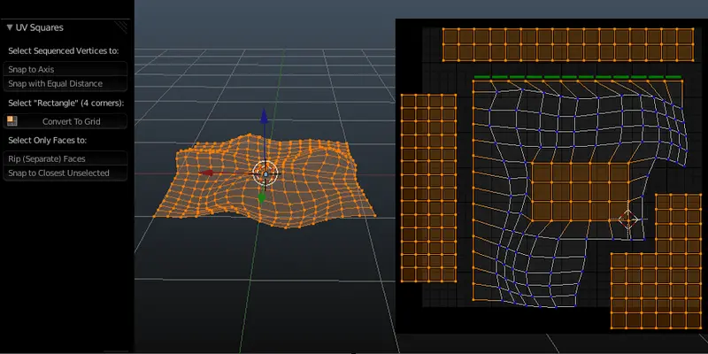
12. The Wrong Way Grain: UV Island Orientation
This is the silent killer of wood and fabric renders.
The Problem
You unwrap a wooden chair. You pack the UVs perfectly. You apply a high-quality oak texture. But when you render, the grain on the seat goes horizontally, while the grain on the legs goes vertically. Or worse, the grain on one leg goes at a 45-degree angle. In the real world, carpenters follow the grain for strength. If your digital grain is going the wrong way, the human eye instantly knows something is wrong, even if it can’t explain the physics of woodworking.
The Fix
- Straighten Your UVs: Use a “UV Square” or “Straighten” tool. For wood and fabric, your UV islands should be perfectly vertical or horizontal.
- Visual Sync: Select all your islands in the UV editor and rotate them together to align with the texture’s flow. If the wood grain in your image is vertical, every single UV island that represents a wooden part should be oriented vertically.
13. Metallic Dielectric Confusion
This is a PBR 101 mistake that ruins the weight of metal objects. Most commonly, it is seen in infrastructure projects. [Learn more about infrastructure projects and their types via our guide]
The Problem
In the real world, materials are either metal or they aren’t. There is almost no middle ground. Beginners often use a gray-scale map for the Metallic channel and end up with values like 0.5. This creates a muddy look that is neither metal nor plastic. It looks like a weird, semi-translucent fog on the surface. Also, many forget that metals have no Albedo (Base Color) detail. Their color comes almost entirely from their reflections.
The Fix
● Binary Thinking
Metal isn’t subtle. It’s decisive. Your metallic map should reflect that. Most of the time, it lives at the extremes, such as solid black or solid white. Gray belongs in the in-between moments. If the metal isn’t exposed, don’t pretend it is.
● Darken the Albedo
Pure metal doesn’t carry bright color the way plastic does. When Metallic is cranked to one, the base color needs restraint. Go dark or stay true to the metal itself (gold, copper, steel tones only). Push it too bright, and the surface starts to glow in ways it shouldn’t. The result feels weightless. Unnatural. Like the object isn’t really there.
14. Neglecting the “Backside”: Double-Sided Mapping
Ever rendered a leaf or a piece of paper and noticed the back looks exactly like the front? Or worse, it’s completely black?
The Problem
Most 3D polygons are one-sided. If you apply a texture to a leaf, the “back” of the polygon is often ignored by the lighting engine. Even if you enable “Double-Sided” rendering, having the same texture on both sides looks fake. Real leaves are lighter on the back; real paper might have text that is mirrored.
The Fix
- Two-Sided Shaders: Use a specific “Two-Sided” or “Thin-Walled” material node. This allows you to plug a different (usually lighter and desaturated) version of your texture into the back-face.
- Translucency: For thin objects, the texture mapping is only half the battle. You need a “Subsurface” or “Translucency” map that allows light to bleed through the texture, showing the “veins” of the leaf when it’s backlit.
15. The “Dirty Mirror” Error: Over-Cooking the Gloss
We talked about roughness, but “Specular” is its misunderstood sibling.
The Problem
People often touch the “Specularity” slider when they should be touching “Roughness.” In a PBR workflow, you rarely need to change the Specular value (usually kept at 0.5). If you turn the Specular up to 1.0 to make something “shinier,” you end up with a surface that reflects 100% of the light, making it look like a supernatural mirror rather than a real object.
The Fix
- Leave Specular Alone: Keep your Specular at 0.5 for almost everything.
- Control the Shine with Roughness: If you want it shinier, make the Roughness map darker. If you want it duller, make the Roughness map brighter. Let the Roughness do the heavy lifting.
The Bottom Line:
Realism in 3D is a game of technical discipline, not just raw creative power. You can have the most expensive GPU on the market, but if you ignore the nuances of UV orientation, color space, and texel density, your work will always feel like a simulation. True immersion happens when the viewer’s brain stops looking for the “seams” of the software.
If you want to ensure your architectural or product renders are flawless and free from these amateur pitfalls, don’t leave it to chance. Reach out to CAD Drafter today for professional 3D rendering and drafting services that guarantee high-fidelity, mistake-free results every time.
Frequently Asked Questions
1. My texture looks sharp in the viewport but falls apart in the final render. Why?
This usually isn’t magic but a setting. Mipmapping or texture streaming may be quietly limiting resolution at render time. Also, check the scale. A 2K map stretched across a massive floor will never survive a close camera, no matter how good it looked earlier.
2. What causes that shimmering, crawling look in animations?
That flicker is Moiré rearing its head. Fine patterns and screen pixels don’t get along. Push your temporal anti-aliasing or anisotropic filtering higher. Still there? Soften the texture slightly. Losing a touch of detail beats a vibrating frame.
3. Is there a safe amount of padding between UV islands?
Yes, and it’s boring but effective. Around 16 pixels for a 2K map. Double that for 4K. Without enough space, the renderer samples garbage between islands, and those thin black seams show up right when you don’t want them. If you do not want the hassle of dealing with all of that yourself, consider hiring a 3D landscape rendering and design company.
4. When should I choose Displacement over a Normal Map?
Normals fake detail. Displacement creates it. If the outline of the object needs to change (rock faces, bark, deep grout), displacement earns its cost. Scratches and fabric? Stick with normals and save your memory.
5. Why do my normal maps look inverted or oddly bright?
That’s usually a coordinate mismatch. A DirectX map dropped into an OpenGL engine flips the lighting logic. The fix is quick. Invert the green channel, and the surface will behave again.
6. Aren’t Albedo and Base Color the same thing?
They’re close, but not interchangeable. Albedo is meant to be clean with no shadows, no highlights, and no baked lighting. If that data sneaks in, the engine fights it, and your material looks inconsistent from one scene to the next.