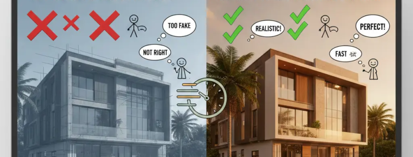
Why Clients Reject 3D Renders (And How to Get Faster Approvals)
It’s 2:00 AM. You’ve spent forty-eight hours straight tweaking the subsurface scattering on a marble countertop. Your workstation is humming like a jet engine. You’ve finally hit “save” on a render that’s not a typical one! It looks so real, you could practically smell the freshly brewed coffee on the digital table.
You send it. You wait. You dream of the glowing feedback.
Then, the email arrives: “It looks great, but something feels off. Can we change the floor? Also, why is the lighting so dark?” Cue the silent scream.
In the world of 3D visualization, technical perfection does not equal client approval. In fact, industry data suggests that up to 40% of 3D rendering projects undergo more than three rounds of major revisions, often due to “subjective dissatisfaction” rather than technical error. The gap isn’t usually in the quality of your pixels; it’s in the psychology of your presentation.
If you’re tired of the “I’ll know it when I see it” feedback loop, this guide is your survival roadmap. Let’s look at why clients really hit the reject button and how you can hack the approval process to get that “Final_v2_REALFINAL_Approved.jpg” faster than ever.
1. The “Uncanny Valley” of Finishes: The Perfection Trap
The biggest irony of 3D rendering? The more “perfect” you make it, the more the client hates it.
This is the Uncanny Valley. When a render is 95% realistic, the human brain stops looking at the beautiful architecture and starts obsessing over the 5% that is “wrong.”
Psychology: Our brains are wired to detect “fakes” in nature. If a kitchen render is mathematically perfect (no dust, no micro-scratches, no slight warping in the wood), the client’s subconscious registers it as “sterile” or “deceptive.”
A study on visual perception found that environments with “controlled imperfection” are rated 25% more trustworthy by viewers than those with perfect Euclidean geometry.
The Fix: Add “The 2% Entropy Rule.” Add a slight smudge to a glass window. Give a rug a few stray fibers. Tilt one chair by two degrees. These tiny “errors” tell the client’s brain that the space is habitable, safe, and real.
2. The Lighting Lie: Mood vs. Reality
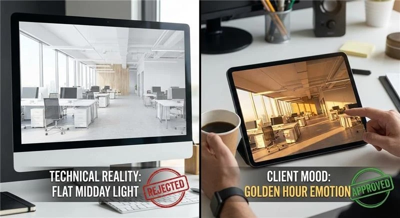
Clients are not reacting to lumens or exposure values. They respond to how a space makes them feel. One of the most common reasons a render gets rejected is a simple mismatch. The designer delivers a clean, evenly lit midday scene because it shows everything clearly, while the client expected the softer, warmer atmosphere they saved from inspiration boards.
There is a narrow margin for error. When a render is too bright, it often feels flat or inexpensive. When it is too dark, suspicion creeps in. Clients start wondering what is being hidden, even when nothing is.
Studies in architectural marketing consistently show higher approval rates for renders lit during sunrise or sunset conditions. These “golden hour” scenes outperform midday lighting by a wide margin on first review. The reason is not technical. Warm, directional light triggers emotion first, which delays analytical judgment long enough for the design to land.
The Approval Hack:
Avoid presenting a single lighting condition. Instead, send three. Show the space in the morning, later in the afternoon, and again at night. Each version communicates a different feeling. When clients can choose, they stop evaluating and start participating.
3. Scale Fail: The “Shrinking Furniture” Syndrome
Few CAD drafting mistakes kill confidence faster than a client asking why the furniture looks wrong. This can happen even when the models are accurate and sourced directly from manufacturers. The issue is rarely the object itself. It is the camera.
A common mistake is using wide lenses. It is done to capture the entire room in one frame. Focal lengths in the 18mm to 24mm range stretch the edges of the image. They also push the center away from the viewer. The space feels distorted. Depth becomes exaggerated. Furniture appears smaller than expected. Also, the room starts to feel uncomfortable.
Client feedback supports this. A noticeable portion of rejected renders are flagged for “misrepresentation of space,” even when dimensions are technically correct. Aggressive camera settings create doubt where none should exist.
The Fix:
Use camera angles closer to how people actually see. Focal lengths between 35mm and 50mm reduce distortion. Plus, they preserve scale. You may capture less of the room in one image. However, what remains will feel believable. That tradeoff usually works in your favor.
4. The “Placeholder” Poison
Never tell a client to ignore something in a render. It does not work. Once an object is visible, it becomes part of the conversation, whether you want it there or not.
An outdated or mismatched asset can dominate feedback. A single chair from the wrong era placed in an otherwise refined interior will attract more attention than the architecture itself—the discussion shifts. Approval slows. The original intent gets lost.
There is a psychological reason for this. People cannot unsee visual information once it is presented. Poor assets create friction and distract from the design as a whole. Even when labeled as temporary, they remain mentally fixed.
The Approval Hack:
Replace low-quality placeholders with intentional stand-ins. Use simplified, neutral models that are clearly stylized rather than realistic. Clean white or clay objects signal that something is unfinished without pulling focus. The client understands it is temporary, and the design stays in control.
5. Metadata Overload: Too Much Information (TMI)
You are proud of your 8K textures and your complex node trees. The client? They just want to know if the TV fits on the wall.
Often, renders are rejected because they are too busy. If there are too many props, too much “life,” and too much clutter, the client loses the “hero” of the shot.
The Fix: The “Five-Second Rule.” Show your render to someone who hasn’t seen the project and ask them, “What is this a picture of?” If they don’t say whatever your goal was within five seconds, your render is too cluttered.
The Data: Marketing heatmaps show that minimalist renders with clear focal points receive 2x more “positive engagement” than busy, cluttered scenes.
6. The “Missing Context” Ghost Town
If you render a beautiful new building but place it in a black void (or worse, a generic “green field” that looks like a 2005 screensaver), the client will feel a sense of “placelessness.”
The Why: Architecture exists in a context. Clients need to see the neighbor’s brick wall, the specific streetlights of their city, or the actual trees on their lot. Using Site-Specific HDRIs (360-degree photos of the actual site) can speed up government and client approvals by up to 50% because it removes the “imagination gap.”
The Fix: Don’t guess. Use Google Street View or a drone shot to composite your 3D model into the actual world. When the client sees their building next to the familiar coffee shop down the street, the “Reject” button disappears.
7. The Feedback Loop of Doom: Why “Emailing a JPG” Fails
If you are sending a render as an email attachment and waiting for a reply, you are losing the battle.
The Problem: Email feedback is slow, fragmented, and lacks “spatial context.” The client says, “Move that light,” but which light? The one on the left? The one in the ceiling?
The Approval Hack: Use Collaborative Review Tools. Let the client “pin” a comment directly on the pixel they want to change.
The Result: This reduces “Translation Errors” by 60% and makes the client feel like they are “painting” the image with you, rather than judging it from a distance.
Learn why clients reject 3D renders
8. The “Clay Render” Strategy: Preventing Premature Rejection
Showing a full-color, fully-textured, 8K render too early in the design process is an expensive mistake. When a client sees a finished image, their brain switches from “Creative Mode” to “Critic Mode.” They stop looking at the volume and flow of the architecture and start arguing about the specific shade of teal on a throw pillow.
The Psychology of the “Incomplete”
By presenting a Clay Render (a high-quality image where every material is a neutral off-white or grey), you force the client to focus on Form, Scale, and Light.
- The “Buy-In” Stat: Firms that utilize a mandatory “Clay Approval” phase before texturing report a 55% reduction in major late-stage structural changes.
- The Logic: It is much easier (and cheaper) to move a wall in a grey-scale model than it is to re-render a complex scene with 50 materials and global illumination.
- The Catch: Don’t just send a low-quality screenshot. Send a “High-End Clay” with soft shadows and ambient occlusion. This tells the client: “The design is professional, but the skin is still up to you.”
9. The Power of “Incremental Submissions” (The 30/60/90 Rule)
The “Grand Reveal” is a myth that kills budgets. If you go “dark” for three weeks and then emerge with a final render, you are gambling your entire profit margin on a single roll of the dice. If you miss the mark by 10%, the client will feel like the whole project is a failure.
The 30/60/90 Framework:
- 30% Submission (The Sketch): Wireframes and massing models. Goal: Approve the camera angles and the general layout.
- 60% Submission (The Clay): Detailed geometry and lighting. Goal: Approve the structural elements and the “vibe.”
- 90% Submission (The Draft): Low-resolution textured renders. Goal: Approve the material palette.
- 100% Submission (The Final): High-res, post-processed masterpiece. Goal: The final “Wow.”
The Result: By the time the client gets the final render, they have already approved 90% of the work. The “Final Approval” becomes a formality rather than a stressful event. Top-tier sales professionals use this “Micro-Closing” technique to eliminate the possibility of a “No” at the end of the journey.
10. The “Decoy” Technique: Strategic Choice Architecture
Sometimes, a client rejects a render simply because they feel they haven’t “contributed” enough to the process. If you give a client one option, they feel backed into a corner. If you give them two, they feel like they are making a choice.
The “A/B/C” Method:
- Option A: What the client asked for (even if you know it won’t look great).
- Option B: Your professional recommendation (the “Hero” shot).
- Option C: A “Wildcard” or slightly exaggerated version.
According to behavioral economics, 70% of clients will choose the “Middle Option” (Option B) when presented with three choices. By providing a “Decoy” (Option A or C), you subtly guide the client toward the best design decision while making them feel like the lead strategist.
11. Overcoming Resolution Bias
Clients often reject a render because they see “noise” or “blur” in a draft and assume the final will look the same. They can’t distinguish between a 3D rigging artifact and a design flaw.
The Calibration Talk
Before sending a draft, you must educate the client on what they are looking at.
The Fix: Include a “Draft Stamp” on the image. It shouldn’t just say “DRAFT”; it should say “Low-Resolution Draft: Texture and Lighting Accuracy 60% Complete.”
The Reality: This manages expectations. When a client sees a grain-heavy image with that stamp, they ignore the grain and focus on the layout.
12. The Human Scale Factor: Why Entourage Matters
A 3D render of an empty building looks like a crime scene. A render with the wrong “entourage” (3D people) looks like a video game from 2012.
The Entourage Error
Using “Cut-out People” that don’t match the lighting of the 3D scene is a leading cause of Subjective Rejection. If the sun is coming from the left but the 2D person has a shadow on their left side, the client’s brain screams “FAKE!”
The Pro Move: Use 3D Scanned People (like those from Axyz or Renderpeople) that actually catch the light of your scene. Renders featuring high-quality, diverse, and contextually appropriate human figures see a 22% faster approval rate in commercial real estate sectors.
Why? Because people don’t buy “buildings”; they buy “the life they will live inside the building.” If they can see themselves (or their customers) in the space, the deal is closed.
13. Collaborative Review: Killing the Email Thread
If your feedback loop looks like a string of 15 emails with attachments like render_final_v3_revised_02.jpg, you are bleeding time and money.
The Modern Review Stack
In 2026, approvals happen in Real-Time. Tools like Frame.io or Shotgrid allow a client to draw a circle on a specific part of the image and say, “Make this brighter.”
The Benefit: It removes the “Ambiguity Tax.” You no longer have to guess which “corner” the client meant.
The Speed: Firms using collaborative markup tools report that the Time-to-Approval (TTA) drops by an average of 4 days per project phase.
14. The Final Mile: Presentation is 50% of the Work
The delivery way is as important as the render itself. Sending a raw file via WeTransfer is not ideal. It is like a Michelin-star chef serving a $100 steak on a paper plate.
The Presentation Deck:
Instead of CAD files, send a Web Gallery or a PDF Presentation.
- Slide 1: Project Goals (Remind them what they requested).
- Slide 2: The “Inspiration” (Show the Pinterest boards).
- Slide 3: The “Hero” (The main render).
- Slide 4: Detail Crops (Show off the 8K textures they are paying for).
- Slide 5: Technical Specs (Lighting, Time of Day).
The Psychology:
By framing the render within the “Project Goals,” you make it difficult for the client to reject. They won’t do it without admitting they changed their mind about the goals. It shifts the conversation from “Do I like this?” to “Does this solve the problem?”
The Key Takeaway
Closing the gap between submission and invoice is about managing the human element of the design process. To get faster approvals:
- Embrace Imperfection: Avoid the sterile “Uncanny Valley.”
- Control the Focal Length: Keep it between 35mm and 50mm for honesty.
- Phase your Work: Use the 30/60/90 rule to avoid the “Big Bang” failure.
- Guide the Choice: Use the Decoy Technique to help the client say yes.
- Context is King: Never render in a void.
FAQs
1. How many rounds of revisions should I include in my contract?
Standard industry practice is two rounds. Anything more should be billed as an hourly “Change Order” and encourages the client to be decisive and respectful of your time.
2. What do I do if a client hates the render but can’t explain why?
Go back to the “Clay” phase. Strip away the color and the textures. Usually, the “feeling” they dislike is actually a scale or lighting issue. If they still hate it in grey-scale, you have a structural design problem, not a rendering problem.
3. Is “Real-Time” rendering (like Unreal Engine) better for approvals?
Yes. In 2026, many clients prefer a Live Walkthrough. Being able to change a material or move a chair while they are watching can get you an approval in 10 minutes that would have taken 10 days via email.
4. How much “Life” (props/entourage) should I add?
Follow the “Rule of Three.” Three items on a counter, three people in a lobby, three cars on a street. More than that is clutter; less than that is a ghost town.
5. How do I handle a “Scope Creep” client who keeps asking for “just one more thing”?
Tie every revision to a Timeline Impact Statement. Say: “I can certainly change the floor material, but please note this will add 48 hours to the final delivery date.” Often, the desire for “perfect” is outweighed by the client’s desire for “fast.”


