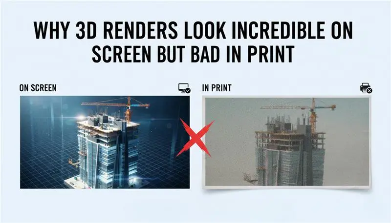
Why 3D Renders Look Incredible On Screen And Fall Apart In Print
Every visualizer has lived this moment. You obsess over a render. On your monitor, it’s flawless, clean, cinematic, and real. Then it goes to print. And suddenly everything collapses. That warm sunset turns dull and heavy. Shadows clog up into featureless black puddles. Subtle textures (metal grain, concrete noise, fabric weave) disappear. What looked premium now feels cheap. Worse, it looks careless. This isn’t a talent issue. And it’s not your renderer betraying you.
It’s the screen-to-print gap, and it trips up even experienced architectural visualizers. Digital images and printed images don’t behave the same way, no matter how realistic your render looks on a display.
In this guide, we’re going to close that gap. Not with vague tips, but by understanding what’s actually happening, how light behaves on a screen, how ink behaves on paper, why “resolution” is often misunderstood, and what professionals do differently to make their renders survive the jump to print.
1. The Real Problem: Light and Ink Play by Different Rules
Before you can fix bad prints, you have to accept one uncomfortable truth: your monitor is lying to you. Politely, but consistently. Screens and printers don’t just show images differently. They operate on opposite principles.
RGB: Color Made From Light
Your monitor works in RGB, red, green, and blue. This system is additive. It starts from darkness and builds color by adding light. Stack all three channels at full power, and you get pure white, bright, luminous, and almost glowing.
Because the image is backlit, screens can display colors that feel electric. Neon blues. Acid greens. Saturated oranges that look like they’re emitting energy. They’re beautiful. They’re also not real in a physical sense.
CMYK: Color Made From Absence
Printers use CMYK: cyan, magenta, yellow, and black. This system is subtractive. You begin with white paper and add ink that removes light. Each layer absorbs more brightness. Stack cyan, magenta, and yellow together and, in theory, you get black. In reality, you end up with a murky brown. That’s why printers need a dedicated black ink. No glow. No backlight. Just reflected light bouncing off paper fibers.
Where Everything Goes Wrong
Here’s the core issue: RGB can represent far more colors than CMYK ever can. That range is called the color gamut, and RGB’s is huge. CMYK’s is not. So when your render contains ultra-saturated blues, intense greens, or high-energy gradients, the printer has no true equivalent. It guesses. It compresses. It compromises. That’s why vibrant renders often come back muted, muddy, or strangely lifeless. Not because the printer failed—but because the colors never existed in ink to begin with.
2. The Resolution Trap: When “Big Enough” Isn’t Big Enough
Another common mistake hides behind a familiar word: resolution. Something can look enormous and razor-sharp on a screen and still be completely unfit for print.
PPI: A Screen Concept
Pixels Per Inch (PPI) only matters in the digital world. A 1920×1080 render looks perfectly sharp on a 24-inch monitor because the screen density sits around 90–100 PPI. Your eye fills in the rest. Everything feels crisp. But that sharpness is contextual. It only works because the image is being viewed on a display at a fixed size and distance.
DPI: A Print Reality
Dots Per Inch (DPI) is physical. Ink on paper. No shortcuts. For high-quality print (magazines, presentation boards, brochures) 300 DPI is the standard. Anything less and the flaws start to show. Edges soften, detail breaks down, and textures blur. Learn more about reducing noise from CAD drawings in our specialized guide. [How To Reduce Noise And Grain From 3D Rendering]
The Math Most People Ignore
If you want a clean 10 × 10 inch print at 300 DPI, your render needs to be 3000 × 3000 pixels. There’s no way around that. Upscaling a small render doesn’t magically add detail. It just stretches existing pixels and asks the printer to invent information that isn’t there. That’s usually the culprit behind prints that feel soft, noisy, or vaguely out of focus, especially when viewed up close on a board or poster. They weren’t rendered for print. They were rendered for a screen.
3. Why Your Shadows Turn to Ink Puddles (Gamma, Brightness, and the “Crushed Black” Problem)
Ever print a render and think,
“Where did all my shadow detail go?”
On screen, everything looks fine. You can see gradients. Soft transitions. Subtle depth. In print? It’s just… darkness. Heavy. Flat. Dead.
That’s not a rendering error. It’s perception.
Your monitor is blasting light directly into your eyes. It creates the illusion of detail even when the values are packed tightly together. Paper doesn’t emit light. It reflects whatever light happens to be in the room. Big difference.
There’s also a technical layer to this.
Most render engines work in linear space. Displays don’t. Screens show images with gamma correction (usually around 2.2). Translation: what looks like “gentle shadow detail” digitally often becomes compressed into near-black once it hits ink.
Real-world fix:
When prepping for print, you almost always have to lift the dark areas more than feels comfortable. A render that looks slightly washed-out on your monitor will often look perfectly balanced on paper. Print punishes subtlety. Plan for it.
4. Calibration: If Your Screen Lies, Everything Lies
If your monitor isn’t calibrated, you’re guessing. Literally.
Most factory settings are designed to impress in a showroom, not to be accurate. Extra contrast. Extra saturation. Cool color temperature. Bright blues. Punchy whites.
Looks amazing for gaming. Terrible for color work.
Here’s the trap: If your screen is too blue, your brain compensates. You warm up your render. Add yellow. Push orange. Balance “by feel.”
Then the file hits a neutral printer, and suddenly everything looks like it’s dipped in mustard. That’s not the printer’s fault. That’s your monitor lying to you for months.
What pros actually do:
They use hardware calibration. Real devices. Not software sliders.
Tools like Datacolor Spyder or X-Rite i1 physically measure your display and build a color profile (ICC) that forces accuracy.
Extra layer of sanity:
If print is a serious part of your workflow, use an IPS panel with high Adobe RGB coverage. Viewing-angle color shift from cheap panels alone can wreck consistency. You move your head. The color changes. Good luck matching prints like that.

5. When Clean Renders Create Dirty Prints (Moire Madness)
Here’s a weird one that catches people off guard. Your render engine smooths textures using filtering and anti-aliasing. Printers don’t print smoothly. They print dots. Tiny patterns. Halftone grids. That is also one of the reasons why materials do not match the CAD Renders.
When those two systems collide (digital smoothing vs physical dot patterns), you get moiré. Those strange waves. The ripples. The fake patterns in brick walls, fabrics, roof shingles, and concrete textures. It’s not random. It’s interference. An easy way to describe it is as: two systems are trying to describe details in different ways.
Counterintuitive fix: Sometimes you have to make the digital image less sharp to get a cleaner print.
Softer anti-aliasing, reduced sharpening, and gentler texture filtering. Filters like Gaussian or Mitchell-Netravali often behave better for print than ultra-crisp digital filters.
Slightly soft on screen → cleaner on paper. It feels wrong. It works.
6. Black Isn’t Actually Black (The “Rich Black” Trick)
In 3D, black is easy. RGB: 0, 0, 0. Done. In print? That’s rarely really black.
Pure K (100% black ink) often prints as dark grey. It wouldn’t be wrong to say it is flat, thin, and lifeless. Especially on absorbent paper.
That deep, luxury-brochure black you admire? It’s not just black ink. It’s layered.
Typical rich black mix:
Cyan + Magenta + Yellow + Black together. Not subtle, not light, but dense!
Example blend: 60% C, 40% M, 40% Y, 100% K.
The result isn’t just darker, it’s heavier. Deeper. More dimensional. Shadows feel solid instead of hollow. Ink density matters as well.
7. Soft Proofing: Seeing the Failure Before It Happens
Printing blind is expensive. Instead, cheat. Use soft proofing in Photoshop, Affinity, or similar tools. It lets your screen simulate how a specific printer and paper combo will behave.
Not perfectly, but close enough to save you money and frustration.
How it works in practice:
- Get the ICC profile from the print shop
- Load it into your software
- Turn on soft proofing
- Enable gamut warnings
Suddenly, you can see which colors will fail. Which gradients will collapse, and which saturations are impossible?
Then you adjust before printing. Lower specific saturations. Shift hues. Balance problem areas manually. You’re no longer guessing. You’re controlling the damage instead of discovering it after the invoice.
8. Paper Stock: The Invisible Material
In 3D software, you spend hours on “Material Shaders.” In the real world, the Paper Stock is your final shader.
- Glossy Paper: Great for high-contrast renders and automotive CAD models. It holds the “RGB-like” vibrancy better, but suffers from glare.
- Matte/Fine Art Paper: Absorbs more ink. It is beautiful for architectural renders but “eats” contrast. You need to boost your render’s contrast by 10-15% to compensate for the absorption.
- Coated vs. Uncoated: Uncoated paper (like standard printer paper) will make your renders look blurry because the ink “bleeds” into the fibers. Always specify Coated Stock for 3D visualization prints.
9. The “Print-Ready” Export Checklist: Beyond the “Save” Button
Once your 3D scene is perfected, your export settings are the final bridge between the virtual and the physical. In 2026, simply hitting “Save As JPG” is a recipe for a muddy, pixelated disaster.
Choosing the Right File Format (This Matters More Than You Think)
File format sounds boring. It isn’t.
The wrong choice here can quietly undo everything you fixed in lighting, color, and contrast. No warning. No error message. Just a print that feels… off.
Let’s break down the usual suspects.
TIFF: The Safe Bet for Serious Print
If you’re sending work to a professional printer and you want zero surprises, this is where you land.
TIFF files are essentially honest. No compression tricks. No data thrown away behind your back. They support high bit depths (16-bit, even 32-bit), which is critical for smooth gradients. Think skies. Soft falloffs. Subtle light transitions.
And here’s the big one: TIFF handles CMYK properly.
Profiles, channels, conversions, everything a printer expects is right there in the file. It’s heavier. Slower. Less convenient. Also, worth it.
PNG: Useful, but Dangerous if You’re Not Careful
PNGs are fantastic online. Transparency. Clean edges. Small file sizes.
Print, though? That’s where things get risky.
PNG doesn’t understand CMYK. At all. Save your render as a PNG and you’ve permanently locked it into RGB. The color conversion has to happen later, whether you want it to or not.
That doesn’t mean “never use PNG.” It means knowing what you’re doing.
If you’re planning to convert colors manually in Photoshop and you need transparency for compositing, fine. Just don’t hand a raw PNG to a printer and expect miracles.
They will guess. Guessing rarely ends well.
EXR: Your Safety Net (Not Your Final File)
EXR isn’t a delivery format. It’s a lifeline. This is what you render when you want options. Full dynamic range. Light values way beyond what a monitor can show. Shadow detail that looks gone but isn’t.
In post, EXR gives you room to recover. Lift blacks. Tame highlights. Balance contrast without tearing the image apart.
Once the image is dialed in, then you convert and export for print. Think of EXR as your negative. Or your RAW file. You don’t print it directly, but you’d be foolish not to start with it.
The Bit-Depth Secret
Always render at 16-bit rather than 8-bit. In an 8-bit image, you only have 256 levels of brightness per channel. When you print a large-scale architectural render, those 256 levels often create visible “steps” or “rings” in the sky or on smooth concrete walls. A 16-bit file provides 65,536 levels, ensuring smooth, photographic transitions.
10. The Post-Production Sharpening Workflow
A 3D render that looks “sharp” on a screen often looks “soft” in print. This is because ink bleeds slightly into the paper fibers (even on coated stock), blurring the edges of your CAD geometry.
The “High Pass” Technique
Professional visualizers use a “High Pass” filter in Photoshop to give the print “bite” without creating digital artifacts.
- Duplicate your final render layer.
- Go to Filter > Other > High Pass.
- Set the radius to a point where you only see the fine outlines of the architecture (usually 1.2 to 2.5 pixels).
- Change the Layer Blend Mode to Overlay or Linear Light.
| Specific Print Hack |
| Increase the opacity of this layer by 15% more than what looks good on screen. This “over-sharpening” compensates for the mechanical softening of the printing press. |
Handling “Noise” and “Grain”
Digital noise looks like “flecks” on a screen, but in print, it can look like “dirt.” If your render has any noise, use an AI denoiser (like Topaz Photo AI or Adobe’s Neural Filters) before you convert to CMYK. Once in CMYK, noise becomes much harder to remove without destroying color accuracy.
11. Large Format vs. Small Format: The “Viewing Distance” Rule
One of the most expensive mistakes in 3D visualization is rendering a 10,000-pixel image for a billboard. You don’t need it, and your computer will melt trying to calculate it.
The Brochure (Close Up)
Requirement: 300 DPI.
Viewing Distance: 12 inches.
Math: An A4 page (8.3 x 11.7 inches) requires a render of approximately 2500 x 3500 pixels.
The Billboard (Distance)
Requirement: 15–30 DPI.
Viewing Distance: 50+ feet.
The Specifics: Because the human eye cannot resolve fine detail at a distance, a billboard actually requires fewer pixels per inch than a business card. For a standard 14×48-foot billboard, a render of 6000 pixels wide is often more than enough.
Pro Tip:
Always ask your print vendor for the “Scale” they want. Many billboard printers work at 1/10th scale at 300 DPI.
12. Bleeds, Margins, and the “Safe Zone.”
In CAD and 3D software, the “edge” of your frame is the edge of the world. In printing, the “edge” is where a giant mechanical blade chops the paper. If your render isn’t set up for “Bleed,” you will end up with a thin, ugly white line around your beautiful 3D image.
The Specs:
Bleed: Standard is 1/8 inch (3mm) on all sides. You must render your image larger than the final page size. If your brochure is 8.5×11, your render should be 8.75×11.25.
The Safe Zone: Keep all text, logos, and “hero” elements (like a specific architectural detail) at least 1/4 inch (6mm) away from the trim line.
Crop Marks: When exporting your final PDF, ensure “Crop Marks” are turned on. This tells the printer exactly where to cut so your 3D horizon line stays perfectly level.
13. The “Final Mile”: Communicating with the Print Shop
Don’t just “upload and pray.” To ensure your 3D renders look professional, you need to provide the printer with a Technical Hand-off.
Specify the Profile: Tell them, “This file is exported in U.S. Web Coated (SWOP) v2” (or whichever CMYK profile you used).
Request a “Match Print” or “Proof”: For high-stakes projects, pay the extra $50 for a physical proof. No monitor can perfectly replicate how ink reacts to a specific paper’s texture.
Check the “Gutter”: If your render is a “Two-Page Spread,” ensure the most important part of the 3D model isn’t right in the middle where the book folds. This is called the “Gutter,” and it will “swallow” your render’s focal point.
14. Managing “Ink Limit” and Total Area Coverage (TAC)
In 3D rendering, we often push our darks to the absolute limit to get that “moody” architectural look. However, there is a physical limit to how much liquid ink a piece of paper can hold before it becomes a soggy, smeared mess. This is known as Total Area Coverage (TAC) or Total Ink Limit.
Most commercial printers have a TAC limit of 300% to 320%.
- The Math: If your “Rich Black” is composed of C=90, M=80, Y=70, K=100, your total coverage is 340%.
- The Consequence: The ink won’t dry properly, leading to “set-off” (where the ink from one page marks the back of the next) or a loss of detail in your CAD model’s textures.
- The Fix: Use the “Info” panel in Photoshop set to “Total Ink.” If you are over the limit, use a Selective Color adjustment layer to pull back the Cyan, Magenta, and Yellow in your “Blacks” until you are under 300%. This ensures your deep shadows remain crisp and dry quickly.
15. The “White Point” Calibration: Matching Paper to Screen
Not all white paper is actually white. Some papers are “Bright White” (with blue optical brighteners), while others are “Cream” or “Natural.” Your 3D render assumes a “perfect” digital white, but the paper will act as a permanent color filter over your entire image.
- The Problem: If you render a minimalist interior with white walls and print it on a “Natural” cream paper, your walls will look yellow, and the client will think the “paint” is wrong.
- The Strategy: Adjust your White Balance in post-production to match the “Paper White.” If you know you are printing on a warm, textured stock, shift your render’s temperature slightly toward the Blue/Cool side (around 200-300K). This counteracts the paper’s natural warmth, resulting in a neutral appearance that matches your original digital intent.
16. Vector Overlays: Handling Text and CAD Linework
If your 3D render includes architectural annotations, labels, or a title block, do not render them inside the 3D software. Rasterizing text (turning it into pixels) is the quickest way to make a professional render look amateur. Because printers use dots, rasterized text often has “fuzzy” or “stair-stepped” edges.
- The Pro Workflow: Export your 3D render as a “Clean” image. Import that image into a vector-based program like Adobe InDesign or Illustrator.
- The Benefit: Place your text and CAD linework (like floor plans or legends) on top of the render as Vectors. Vector text is sent to the printer as mathematical paths, resulting in razor-sharp edges that are 100% legible even at tiny font sizes.
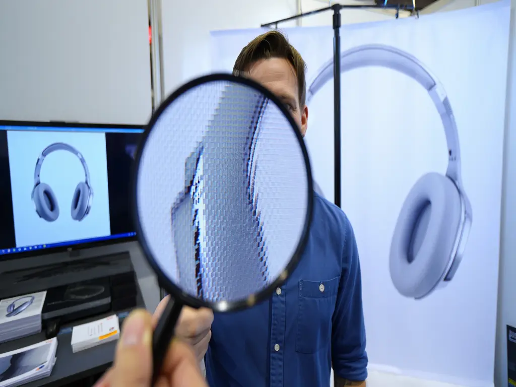
17. Dealing with “Dot Gain” in Fine Textures
When an ink dot hits paper, it spreads. This is called Dot Gain. This is particularly lethal for 3D renders that feature fine “Linear” textures, like brushed metal, carbon fiber, or high-end fabric weaves.
- The Visual Result: A texture that looks like “fine threads” on your screen will likely “fill in” and look like a solid, muddy color in print because the dots expanded and touched each other.
- The Calibration: To fight dot gain, you need to increase the contrast of your textures specifically. Open the “Levels” or “Curves” for just the textured areas and pull the mid-tones apart. By making the “gaps” in the texture slightly wider and brighter than you think they need to be, you give the ink “room to grow” without losing the definition of the material.
18. The “Transparency Flattener” Trap
If you are placing your 3D render into a layout with transparent elements (like a logo with a drop shadow or a translucent color bar), you run into the Transparency Flattener issue.
- The Error: Some older print workflows (PDF/X-1a) “flatten” transparency, which can cause thin “white lines” or “stitching” to appear across your 3D render where the transparency overlaps.
- The Solution: Always export your final print PDF as PDF/X-4. This format supports “Live Transparency,” meaning the printer’s software handles the layering, preventing those ugly white stitch lines from cutting through your render.
19. Lighting for the Viewing Environment
Finally, consider where the client will actually view this print.
- The Office Environment: Most offices use cool, 5000K-6000K fluorescent or LED lighting.
- The Gallery/Home Environment: These often use warm, 2700K-3000K halogen or incandescent bulbs.
- The Adjustment: Light has its own “Color Rendering Index” (CRI). If your render is being shown in a warm, dimly lit boardroom, you should increase the overall Exposure by 0.5 stops and slightly boost the Saturation. A print that looks “perfect” under your bright desk lamp will look “dead” in a moody, low-light boardroom.
Conclusion:
We’ve all been there: staring at a print that looks like it was salvaged from a shipwreck while the digital version on your monitor is a god-tier masterpiece. The truth is, your screen and your printer are basically in a long-distance relationship where they don’t speak the same language.
By knowing the secrets of CMYK conversion, beefing up your shadow gamma, and giving your textures that extra bite with professional sharpening, you’re doing more than just printing a file, you’re translating a digital soul into a physical reality. Precision in these final steps is what separates the hobbyists from the pros. It ensures that when your client finally holds that render, the only thing they say is “wow,” not “why is it so dark?”
FAQ: Printing 3D Renders
1. My render has “banding” in the sky when I print it. How do I stop this?
This happens when you use 8-bit files. Switch to 16-bit rendering. If the banding persists, add a tiny amount of “Noise” or “Dither” (around 1-2%) to the sky in Photoshop. This breaks up the solid blocks of color and helps the printer blend the ink.
2. Should I convert to CMYK in my 3D software or in Photoshop?
Always do it in Photoshop (Post-Production). 3D engines are designed to calculate light in RGB. Converting to CMYK inside the renderer can cause lighting artifacts. Render in RGB/Linear, then convert to CMYK as the very last step.
3. What is the best paper for architectural renders?
For the “Wow” factor, use Satin or Luster Coated paper. It provides the deep blacks of glossy paper but without the distracting reflections, making it perfect for viewing under office lights.
4. Why is my “Sky Blue” coming out purple?
This is a classic “Out of Gamut” error. Many bright blues in RGB contain a hint of red that becomes dominant when converted to CMYK. Use the Hue/Saturation tool to shift your blues slightly toward Cyan before printing.
5. Does the printer’s “DPI” need to match my “PPI”?
No. Your file should be 300 PPI. The printer might print at 1200 or 2400 DPI (physical ink dots). As long as your file is 300 PPI, the printer’s software will handle the rest to ensure a sharp image.

